此頁面目前僅提供英文版本
繁體中文版本正在製作中。如有任何疑問,歡迎隨時透過 Eva 或聯絡表格與我們聯繫。
Samuel Cochrane
UX/UI & Graphic Designer portfolio
問題定義
Samuel Cochrane, a UX/UI and Graphic Designer based in Berlin, had already built three versions of his portfolio website using different platforms — each one worse than the last. The sheer number of tools, templates, and conflicting best-practice advice left him paralysed, unable to make meaningful progress. When he did push something live, it was undermined by unresponsive layouts, buggy behaviour, and platforms that couldn’t realise his creative vision. As a designer whose career depends on the first impression his portfolio makes, having a subpar site wasn’t just frustrating — it was actively costing him opportunities. He needed a portfolio that finally matched his own high standards for aesthetics, performance, and attention to detail, without fighting against a template ever again.
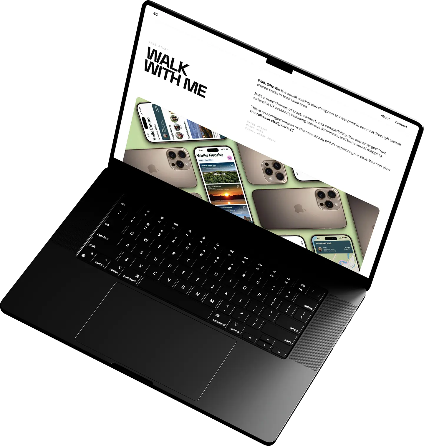
Before Tom stepped in, I’d built three versions of my website using different builder platforms, each one worse than the last. The sheer number of tools, templates and “best-practice” tips left me paralysed, and when I did make progress it was often undermined by unresponsive layouts and buggy behaviour.
技術方案
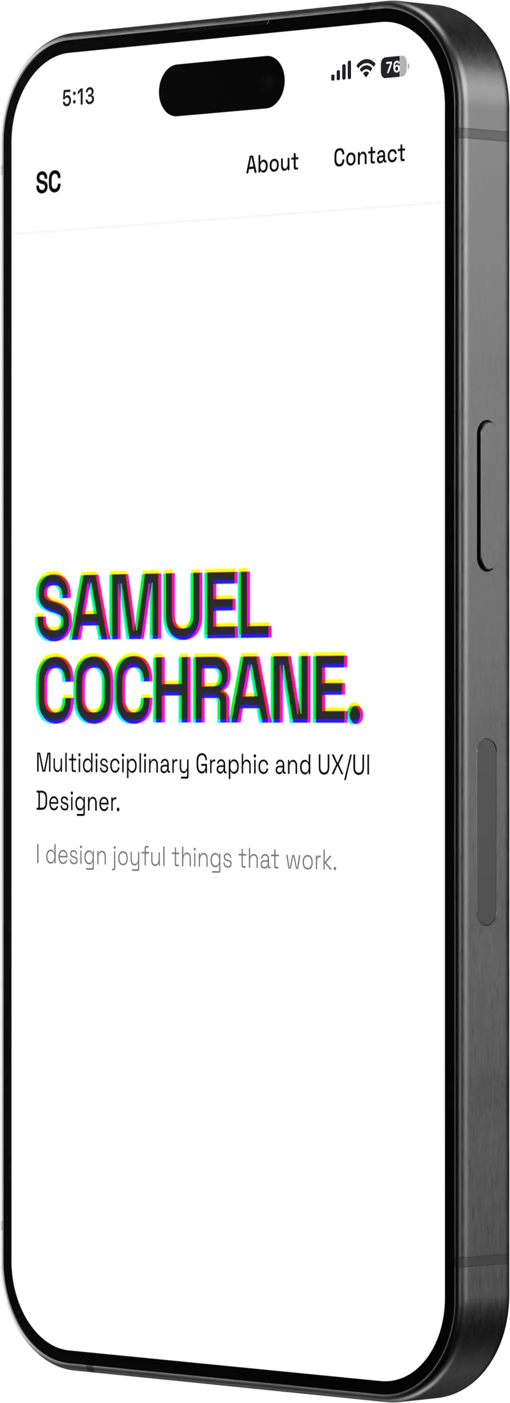
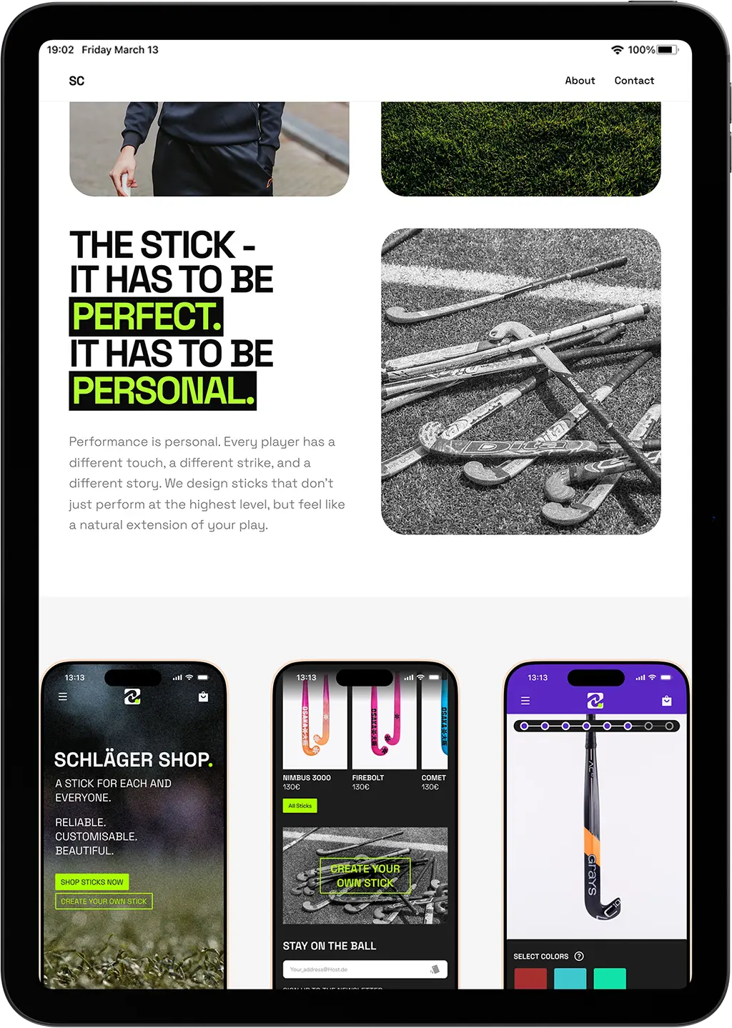
Rather than forcing another template to fit, I built Samuel a fully custom portfolio using Next.js and Tailwind CSS, treating the design system as the foundation rather than an afterthought. Every component was crafted with the same care he brings to his own client work: smooth page transitions for a polished feel, optimised image delivery to keep load times imperceptible, and a clean, typography-first layout that lets his case studies breathe. The development process was collaborative throughout — I translated his Figma comps into a live, responsive site that works flawlessly across every device. No page builders, no compromises, no platform lock-in. Just a site that performs as well as it looks, built on a stack he can extend however he wants.
最終成果
The result is a lightning-fast portfolio that serves as Samuel’s primary tool for landing high-level design roles and freelance opportunities. He now has a site that actually reflects his capabilities — something the previous builder platforms couldn’t deliver despite months of effort. The investment in a custom build eliminated the overhead of fighting templates entirely, freeing him to focus on what matters most: his design work. Since launch, the site has been a consistent reference point in conversations with potential employers and clients, helping him secure positions that align with his senior-level expertise and creative ambitions.
喜歡我們的作品嗎?
我們可以協助您打造類似的項目。無論您剛起步還是已有完整構想,歡迎與我們聊聊,或許我們能幫助您實現。
Or email hello@rainetech.net